Temple Foods
Branding & Website Case Study
Project Strategy
Based out of Kelowna Canada, Temple Foods provides environmentally friendly food delivery to their local area.
They required a brand package and website design to help their ideal clients find their services. Their brand needed to showcase their sustainability values and a food menu that catered toward an active audience.

Visual Branding
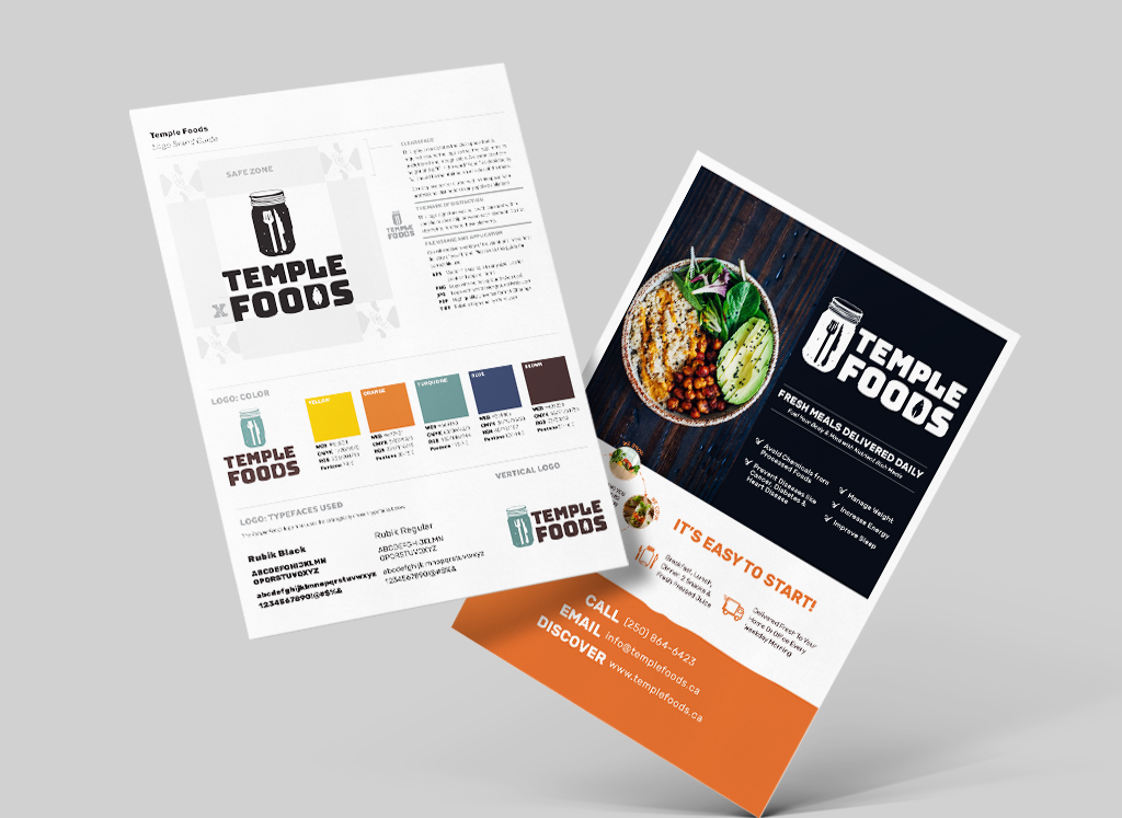
The Temple Foods brand was inspired by their recyclable mason jar packaging and eco-friendly approach to food delivery.
The logo offers a visceral execution relating to the organic nature of Temple Foods meals with a whimsical feel. It also clearly shows the concept of the business through the fork and knife imagery.
The brand was solidified through a consistent color palette and font selection that ensures the brand presence will remain cohesive across any deliverable.
Website Design
After a solid brand foundation was developed, we delved into creating an online presence for Temple Foods.
The website needed to clearly showcase the delivery process and steps to order.
Secondary graphics and imagery were designed to bring the brand to life.


Branding Results
Temple Foods was able to expand their clientele and distribution through their new online presence and marketing materials.
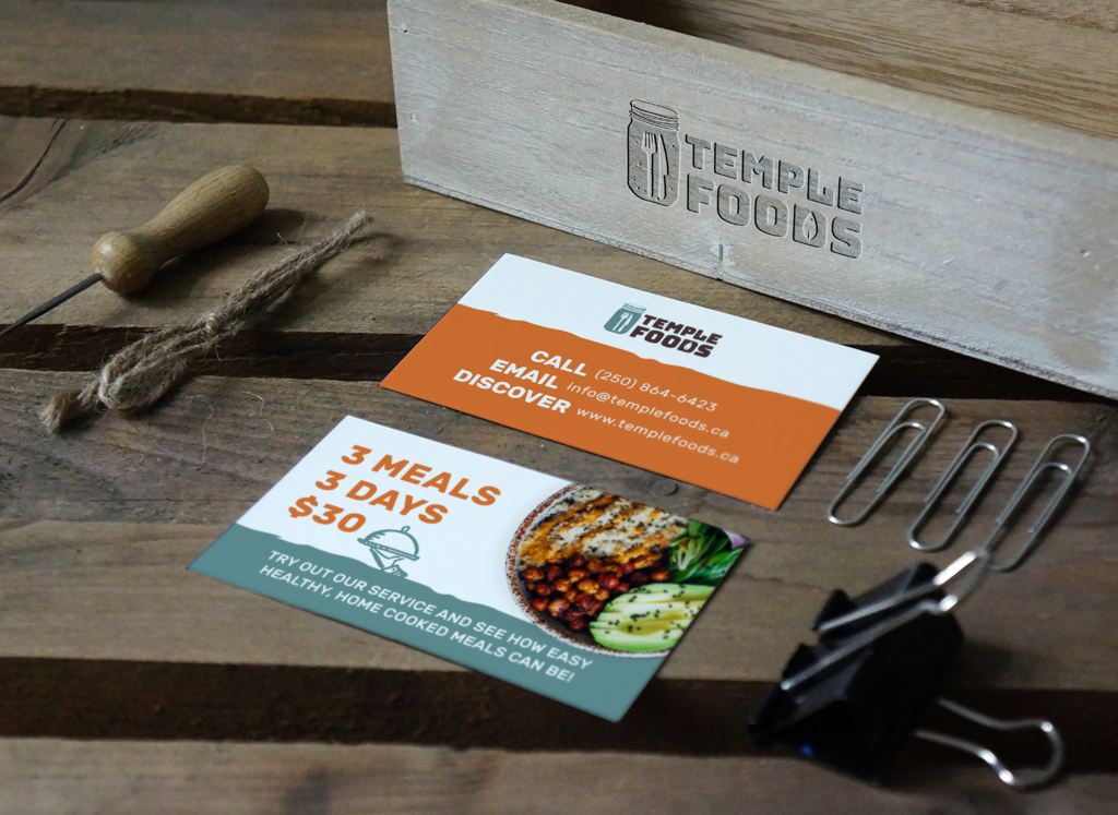
Additional collateral was designed to help advertise their official brand launch, including business cards, brochures, and a social media presence. Their new brand and website helped Temple Foods expand their operations to Los Angeles and serve more people in both Canada and the USA.


When we wanted to redo our logo, we hadn’t put too much thought into the rest of what would come along with this process. Live Large Design walked us through a strategy that helped us define our business more clearly.
Previously, we rambled when we explained who we were and why we were different. After this process, we now have a defined brand guidelines document with the exact words, fonts, and colors which flow into every single thing we do! This has made us not just a successful company, but we are a sought after brand.
Once we rebranded with Live Large Design, we remodeled our storefront to match and threw a profitable launch party. We have implemented the rebrand into our website, the feeling we portray on Instagram, our printed materials, and the customer experience in our stores.
Taking the time to define who we are with so much detail, has helped us connect with the right brands for our story and align with the right target audience. It has allowed us to explain our passion so much clearer and that has created a frenzy with our customers.
Liz Neddo
Maple City, USA
Book your Scale in Style Free Assessment


